
A brand, app and website for a travel concierge that arranges the world for you.
Mercury brings discovery, booking, live trips, personal preferences and a personal concierge together in one place. We designed the brand, the iOS app and the marketing website, from the mark to more than 120 app screens.
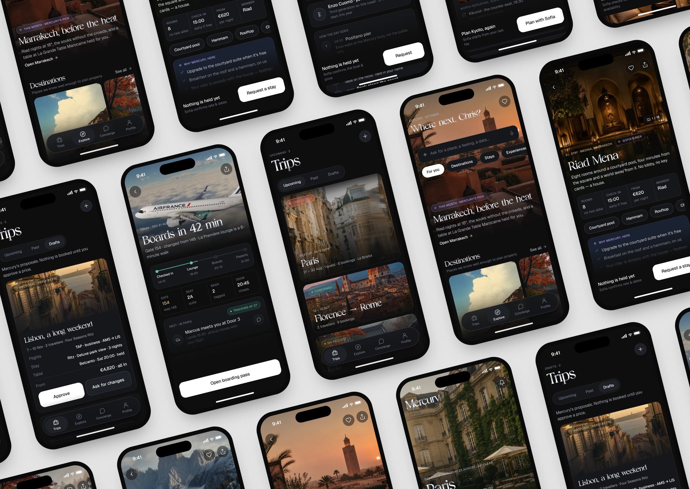
FIG. 1 — The Mercury app: every trip, in one place
The challenge
Travel at this level runs on dozens of moving parts. Mercury wanted all of them in one calm place.
Flights, hotels, restaurants, cars and every request in between usually live across inboxes, apps and phone calls. Mercury set out to bring discovery, booking, live trips, personal preferences and a human concierge into a single app, for members who expect things to simply be handled.
The product had to work for a first trip and for a member’s fiftieth, grow from travel into dining, wellness and cultural access over time, and feel as considered as the hotels it books.
FIG. 2 — Destinations, stays and trips in the app
Our approach
We started from one idea: tell Mercury once, and it arranges the rest.
Preferences sit at the centre of the product. A guided onboarding captures how a member likes to fly, stay, dine and spend their time, from cabin, seat and room setup to allergies and interests, and Mercury applies it to every booking after that.
Around that file, the app is organised in four places: Trips for everything booked, Explore for what to book next, Concierge for anything else, and Profile for what Mercury knows about you.
FIG. 3 — The rosette mark: four circles inside a fifth
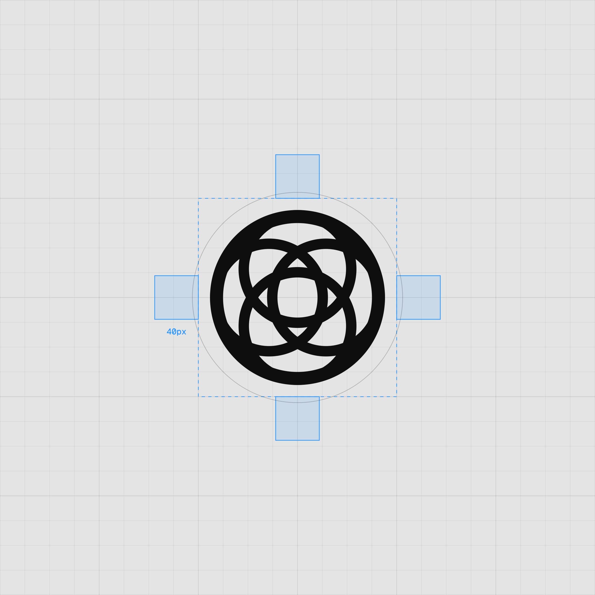
FIG. 4 — The mark on its keyline grid
“The world is arranged for you.”

The solution
A quiet, editorial brand and an app that keeps the whole trip in one place.
Trips unfold as a live timeline: when a flight moves, the trip moves with it, and the car and hotel around it follow. Explore reads like a travel magazine, with hotels, villas, trains and experiences to book or hand to the concierge. And with Mercury Plus, members simply ask, by message, and Mercury handles it.
- Brand identity and rosette mark
- iOS app, 120+ screens
- Onboarding and membership flows
- Marketing website
- App icon and brand guidelines
FIG. 5 — Ask Mercury: the concierge, one message away
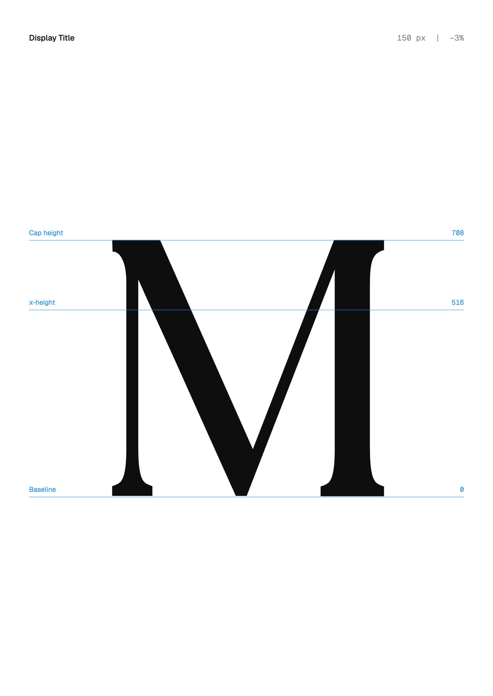
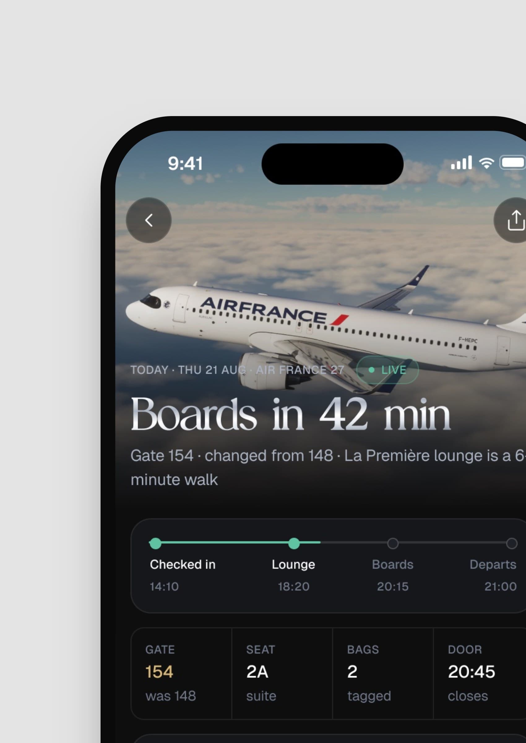
FIG. 6 — Editorial Today, choosing a dinner time and flight day in the app
FIG. 7 — Destinations, stays and experiences
Design system
Silver, midnight and black, with an editorial serif for the moments that matter.
The rosette mark is built from four overlapping circles inside a fifth, drawn on a strict construction. Editorial Today sets headlines and destinations; Geist handles everything functional, from flight numbers to prices. A silver gradient, a deep midnight blue and near-black carry the brand across the app, the website and the membership card, with clear rules for spacing and lock-ups.
FIG. 8–10 — The palette, the four chapters of a profile and Mercury Circle
The result
app screens designed, from the first launch to the day you fly home.
Brand, app and website now share one system. New destinations, collections and membership features slot in without redesigning what is already there.
Credits
See where your website is
leaving growth on the table.
Drop in your URL. We run an AI scan on conversion, speed, search and brand, then send you a clear report with the three fixes that matter most.
Top fix: your pricing page has no clear next step. Adding one CTA could lift demo requests.