
A brand and website for the AI receptionist built for dental groups.
Rondah answers every call for dental support organizations: booking, rescheduling and following up, day and night. We gave the company a brand, a website and a product interface that feel as calm and dependable as the best front desk.
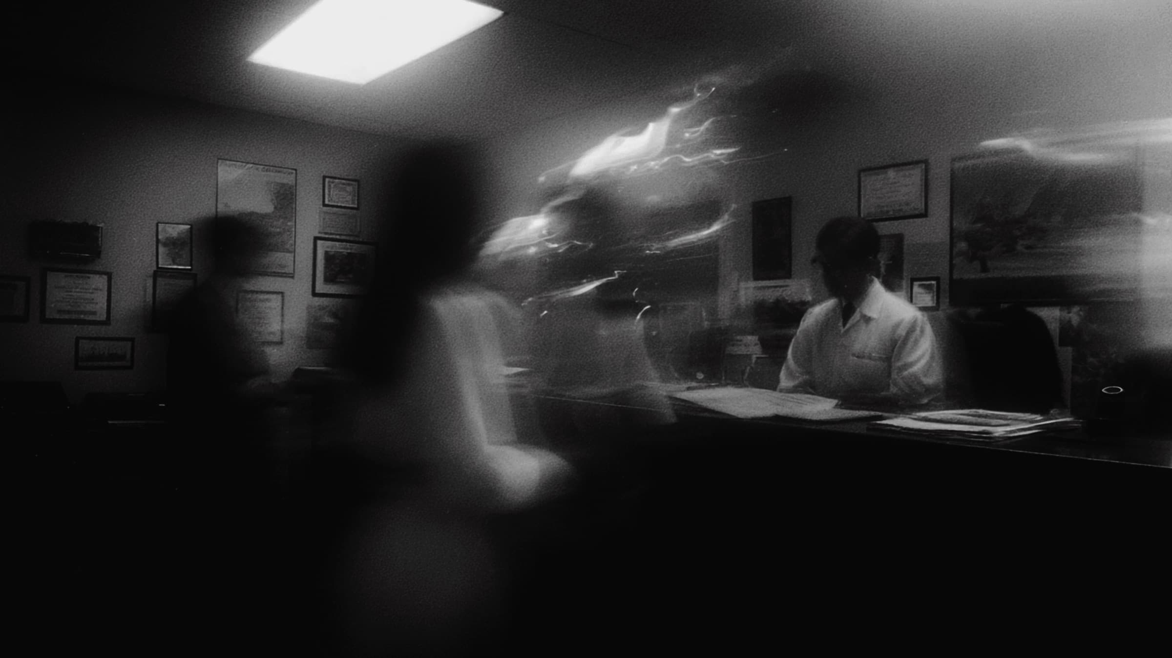
FIG. 1 — The rosette mark over the brand’s black-and-white photography
The challenge
Every missed call at a dental office is a missed patient. Rondah fixes that, but it had to look like a company a large dental group would trust with its front desk.
Rondah’s founders grew up working the front desk of a family dental practice, and named the company after its receptionist of fifteen years. Their AI agents answer every call, book straight into the practice management system and follow up with patients, around the clock.
The product was already running in hundreds of practices. The brand had to catch up: human and trustworthy in a market full of generic AI tools, and clear enough for the people who run multi-location dental groups.
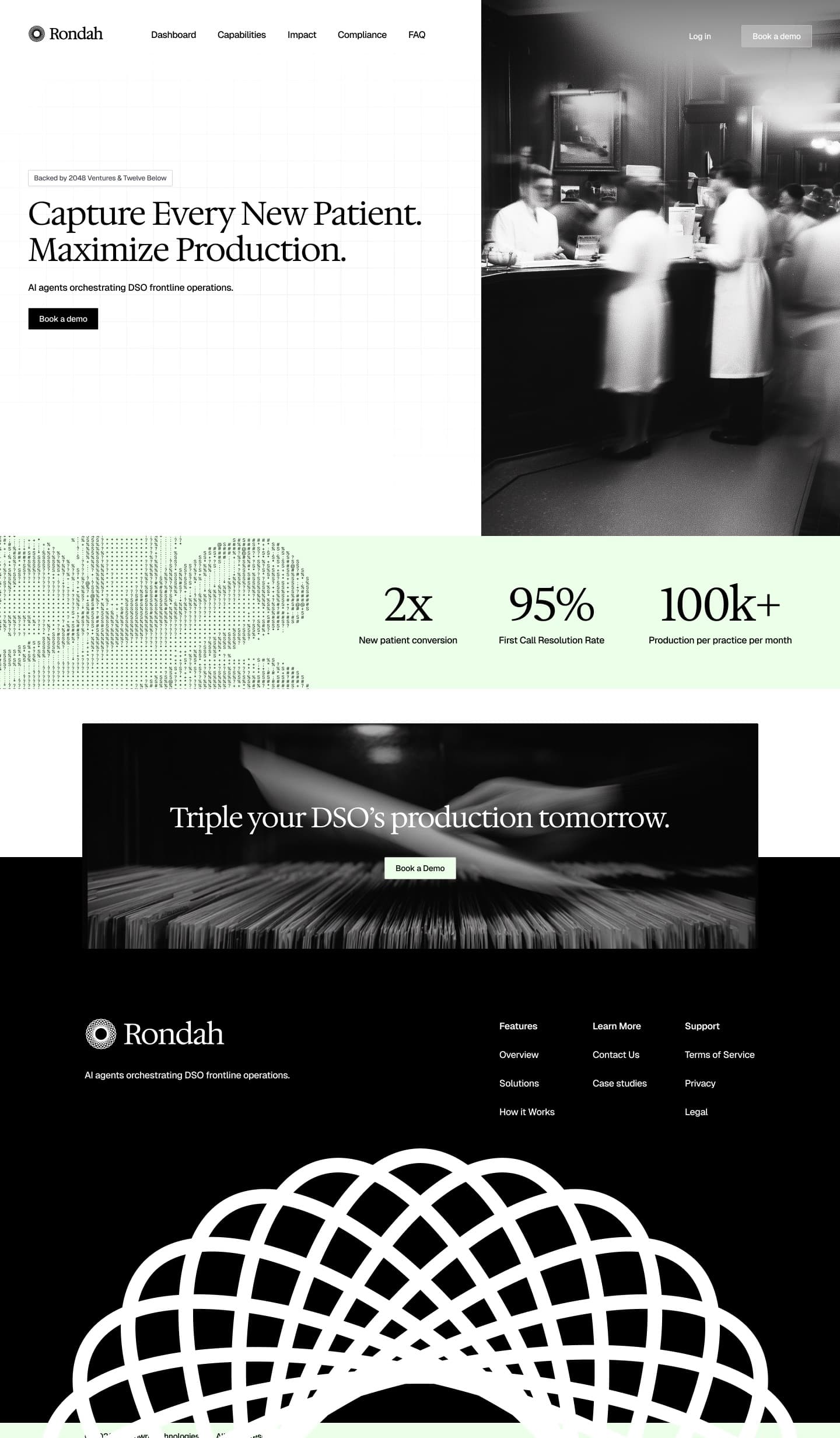
FIG. 2 — The homepage, from the first promise to the dome in the footer
Our approach
We built the brand on the story behind the name: a front desk that has seen it all.
Black-and-white photography of front desks, paperwork and treatment rooms gives Rondah a sense of history and care, far from the glowing gradients most AI companies use.
The mark is a rosette of thirteen overlapping ellipses: many conversations around one steady centre. It works as a small symbol in the navigation, as a 3D object on the website and as the wireframe dome that closes every page.
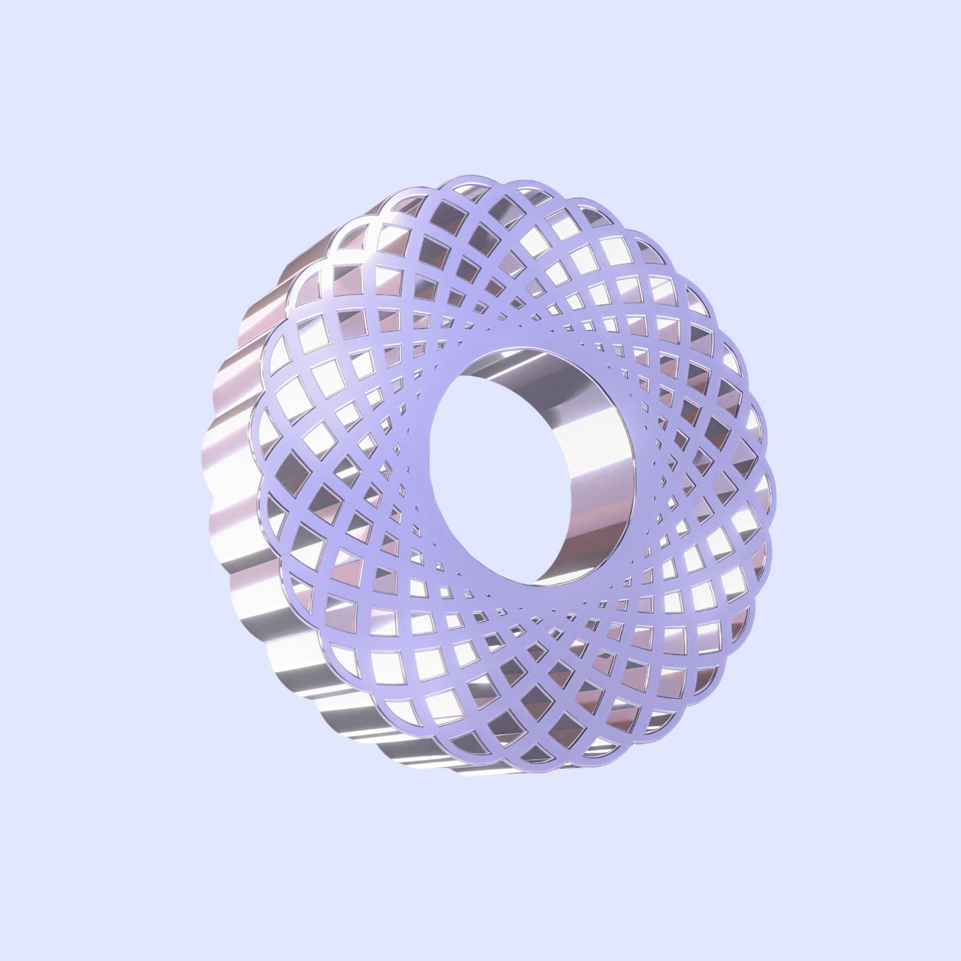
FIG. 3 — The rosette, rendered in 3D for the website
FIG. 4 — Hedvig Letter sets the tone, Geist does the work
“Before we were founders, we were helpers.”

The solution
One voice from the website to the product: calm, clear and always on.
The website leads with the outcome dental groups care about, capturing every new patient, and backs it up with results, integrations and compliance. The same dark, glassy interface carries into the product: a booking flow for patients and an operations command centre for the people running the group.
- Brand identity and rosette mark
- Typography and colour
- Marketing website, 9 pages
- Product UI: booking flow and command centre
- Funding announcement graphics
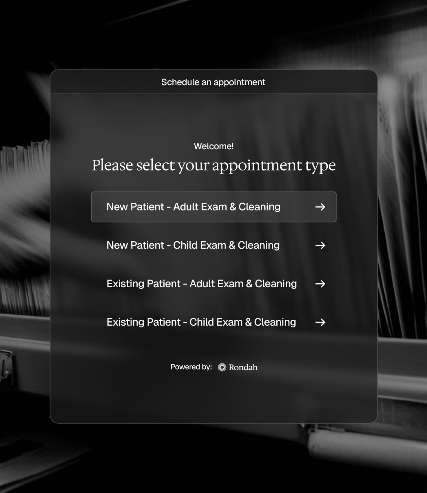
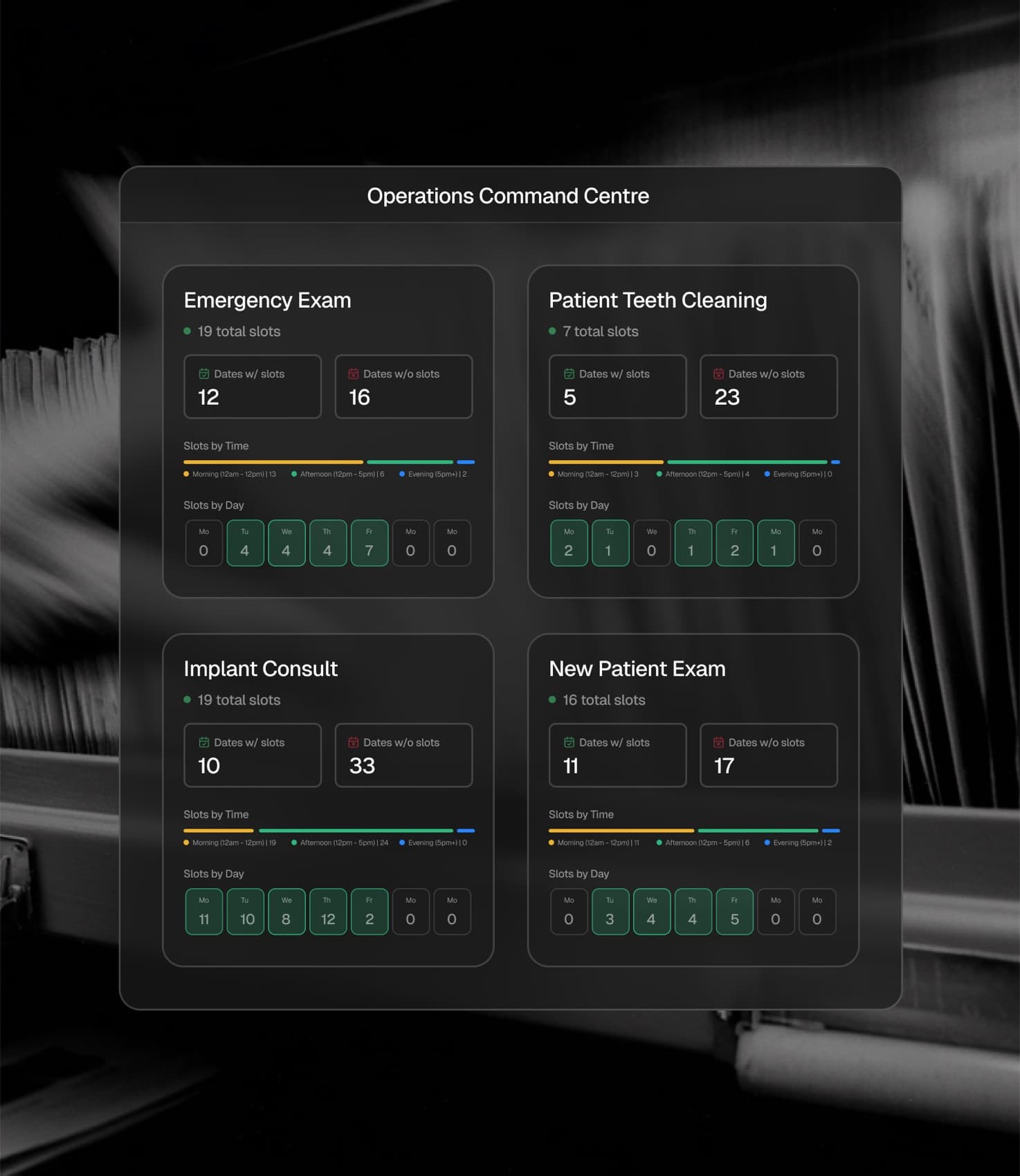
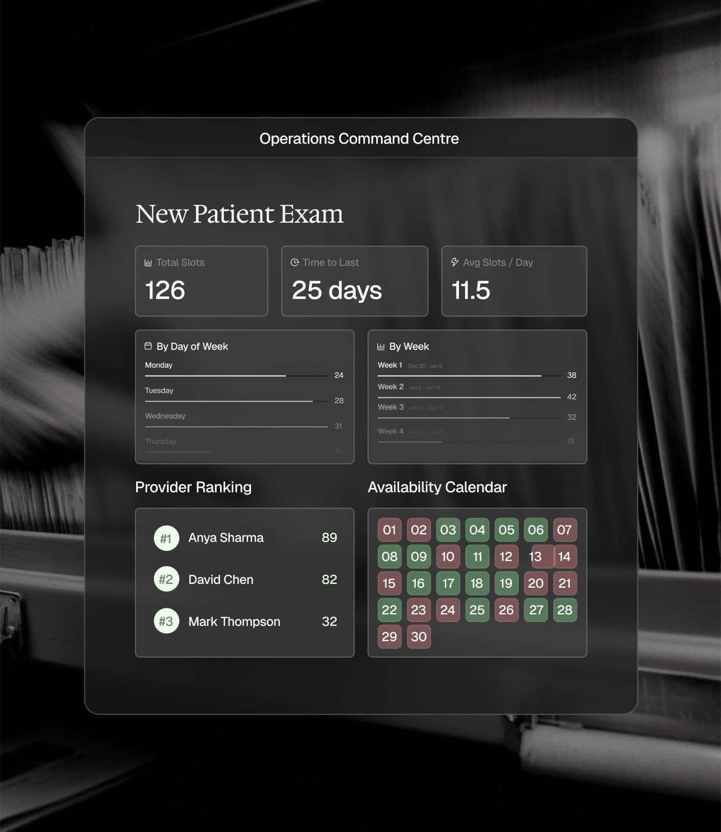
FIG. 5 — Booking, the operations command centre and the new patient exam view
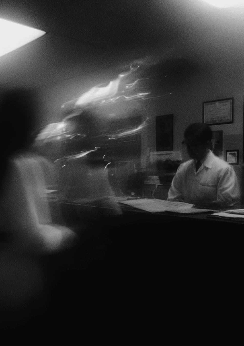
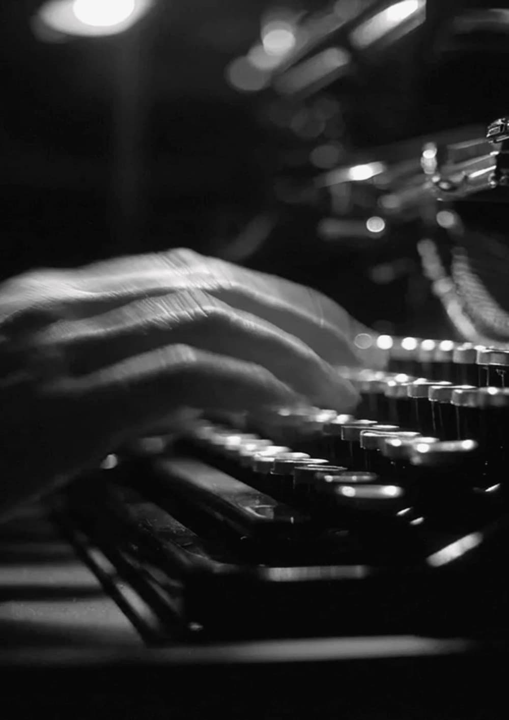

FIG. 6 — The photography: front desks, paperwork and treatment rooms in black and white
FIG. 7 — The wireframe dome that closes every page
Design system
Two typefaces, one blue and a lot of black and white.
Hedvig Letter, a warm serif, carries the headlines. Geist handles interface text and numbers. A single blue does the highlighting, so the photography and the product can do the talking. Website pages and product screens share the same components, so new pages look like Rondah from the first draft.
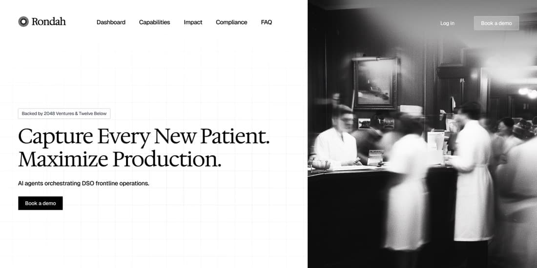
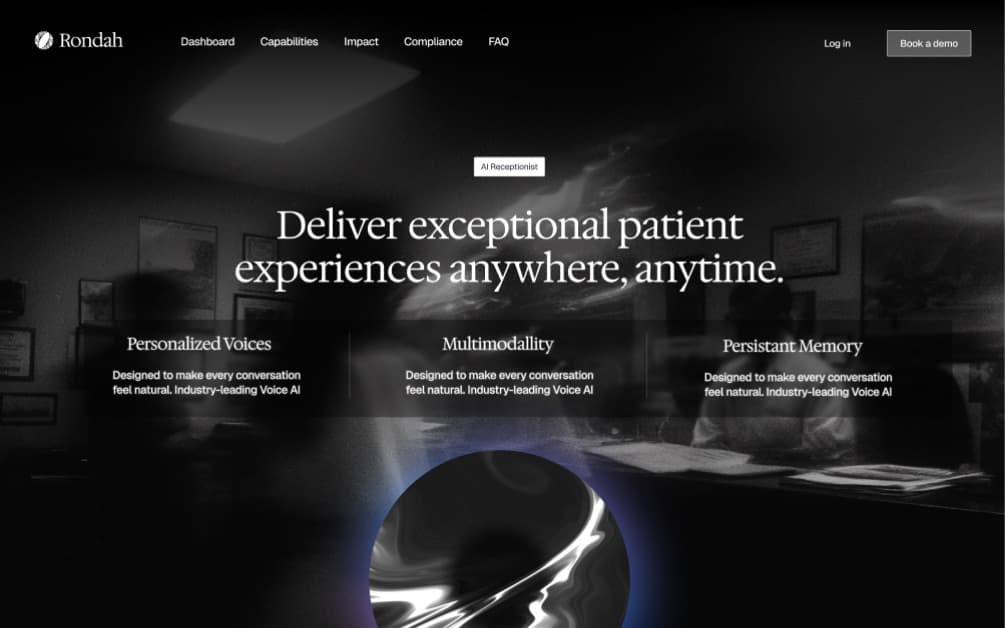
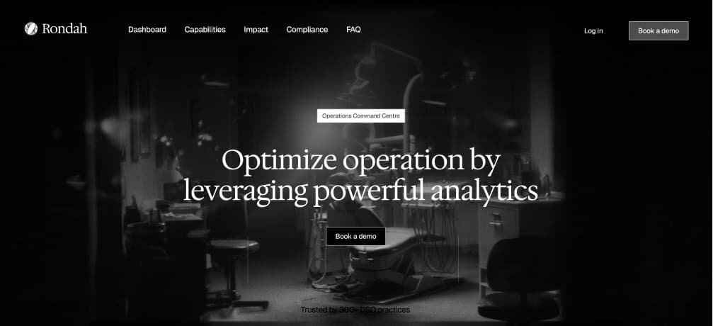
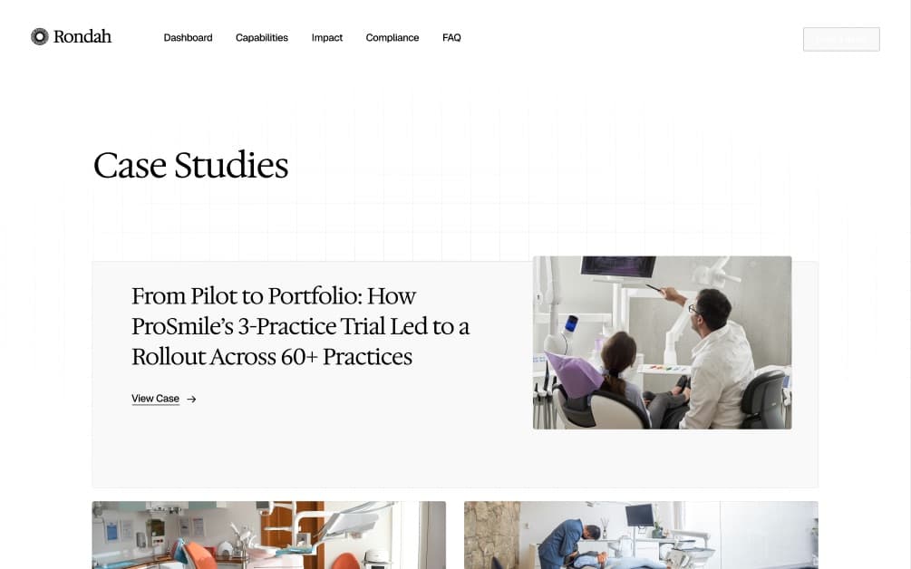
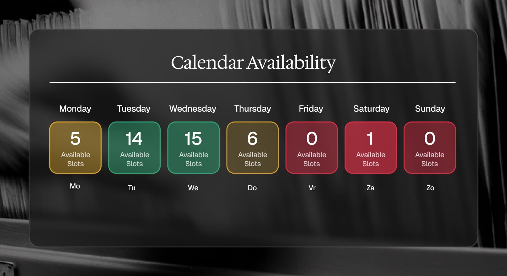
FIG. 8–10 — Website pages, the palette and calendar availability in the product
The result
DSOs and practices across the US and Canada now meet Rondah through this brand.
In April 2025 Rondah announced a $3.5M pre-seed round, co-led by Twelve Below and 2048 Ventures, with graphics in the new brand. The system now carries the company from the front desk towards the whole front office.
Credits

See where your website is
leaving growth on the table.
Drop in your URL. We run an AI scan on conversion, speed, search and brand, then send you a clear report with the three fixes that matter most.
Top fix: your pricing page has no clear next step. Adding one CTA could lift demo requests.