
A brand and website for an AI-native pharma agency, ready for its Series A.
Solstice launches compliant pharma campaigns with its own generative models, taking medical, legal and regulatory review from three months down to days. We built the brand and the website it took into its $21M Series A.
FIG. 1 — The new Solstice website, page by page
The challenge
Solstice sells speed. Its brand couldn’t look like the industry it is replacing.
Solstice is an AI-native agency for pharma. Its promise is compliant campaigns for HCP, patient and launch teams in days instead of months, by taking medical, legal and regulatory review from three months down to days.
The company was heading into its Series A. Every investor, candidate and top-20 pharma brand doing due diligence would land on the website first. It had to hold up, and it had to feel nothing like a traditional pharma agency.
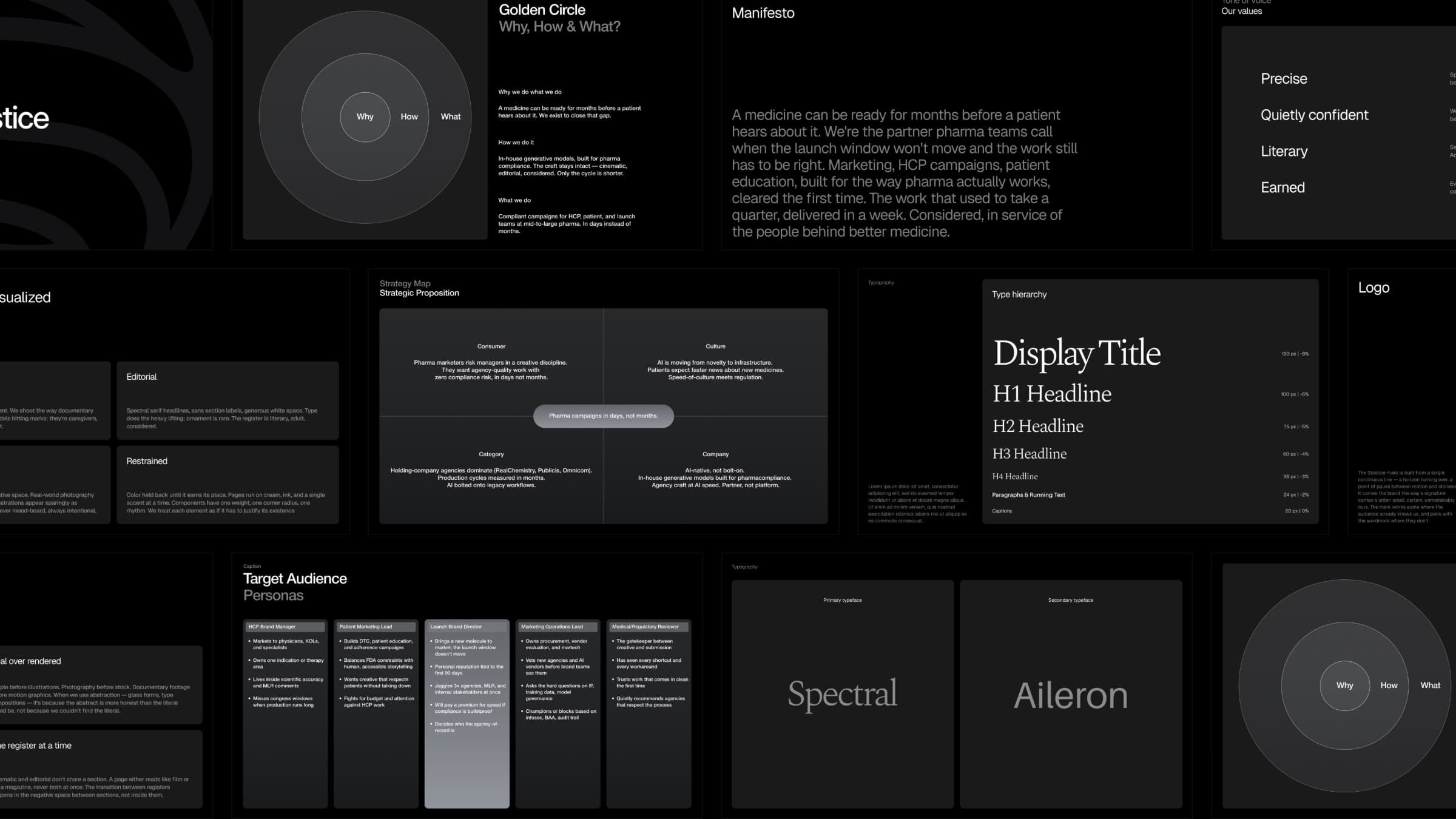
FIG. 2 — The strategy deck: golden circle, manifesto, audiences and type
Our approach
We started from why Solstice exists: a medicine can be ready for months before a patient hears about it.
Strategy came first: positioning, audiences and a golden circle. Why: close the gap between a ready medicine and the patient. How: in-house generative models built for pharma compliance, with the craft left intact. What: compliant campaigns in days instead of months.
That set the tone. Calm, cinematic and editorial, with sky, sunrise and real people instead of pills and lab coats. Spectral for headlines, Aileron for everything else, and a palette that runs from Canvas to Sun.
FIG. 3 — Why, how and what
FIG. 4 — Built for every therapeutic area
“Visinex consistently delivers polished, thoughtful design work and iterates on it remarkably fast. They’re also genuinely open to ideas and feedback, which makes collaborating with them easy and productive!”

The solution
A polished identity and a Framer website the Solstice team can grow without a developer.
The identity covers positioning, type, colour and motion. The website runs on Framer, with a mega-menu structured the way pharma teams actually think: by company type, brand stage, therapeutic area and team.
Behind it sit close to 20 CMS-driven solution pages the team extends on its own, and a newsroom built to carry announcement-day traffic.
- Positioning and brand strategy
- Brand identity: type, colour, motion
- Framer website with mega-menu
- CMS-driven solution pages
- Newsroom
- Product and social visuals
FIG. 5 — Areas, teams and deliverables in one system
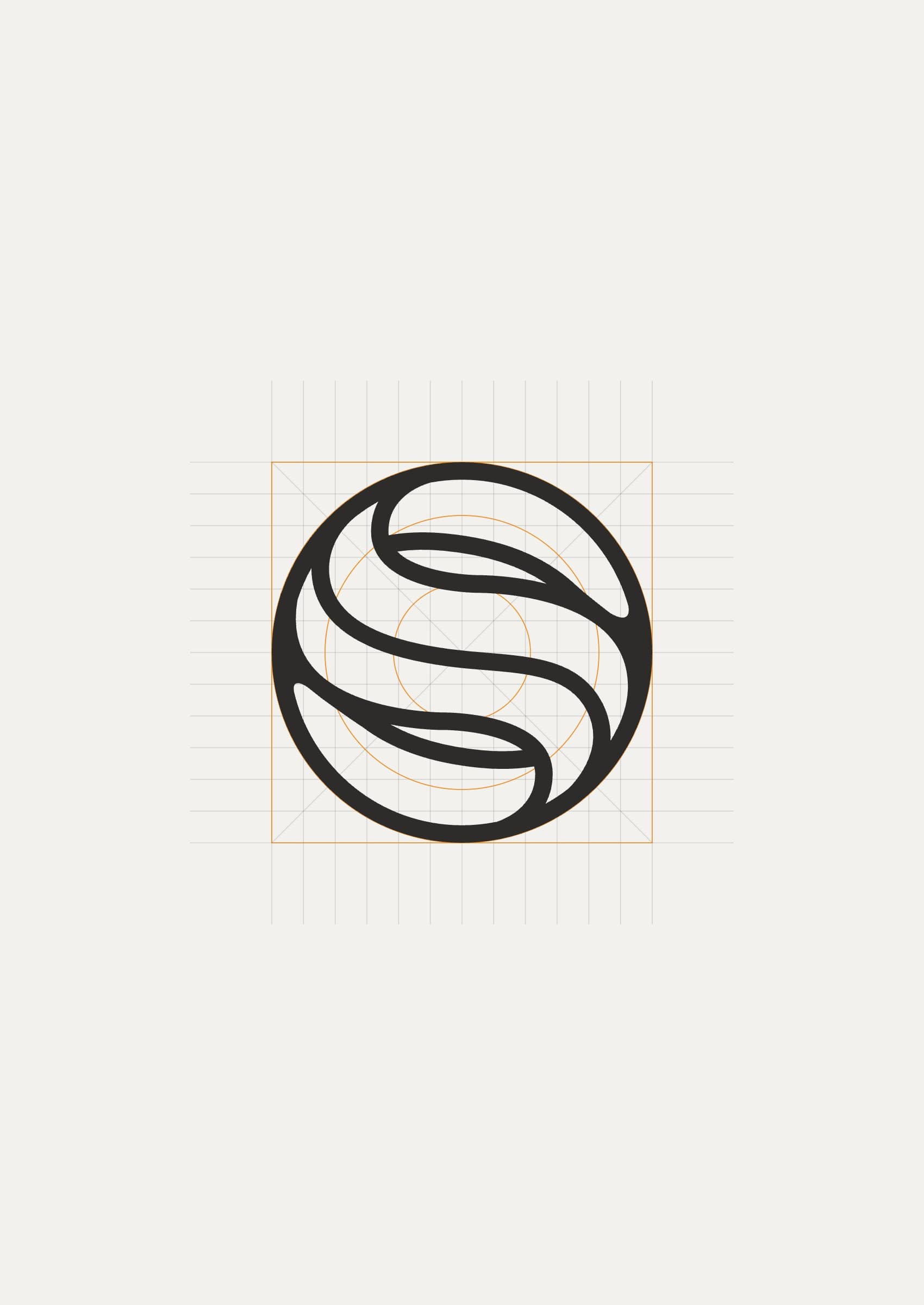
FIG. 6 — The mark on its keyline grid, 12x faster content development and a stippled portrait
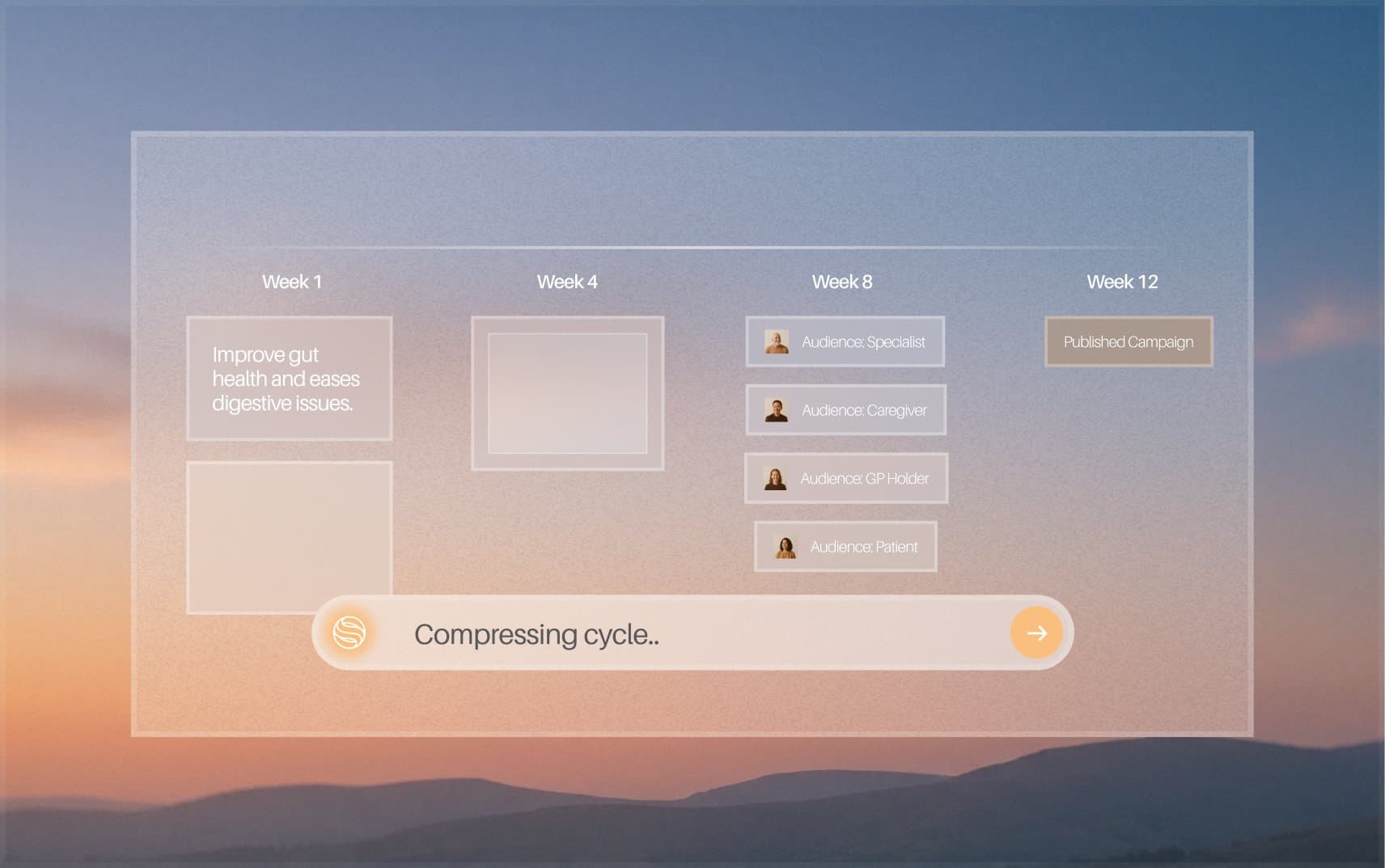
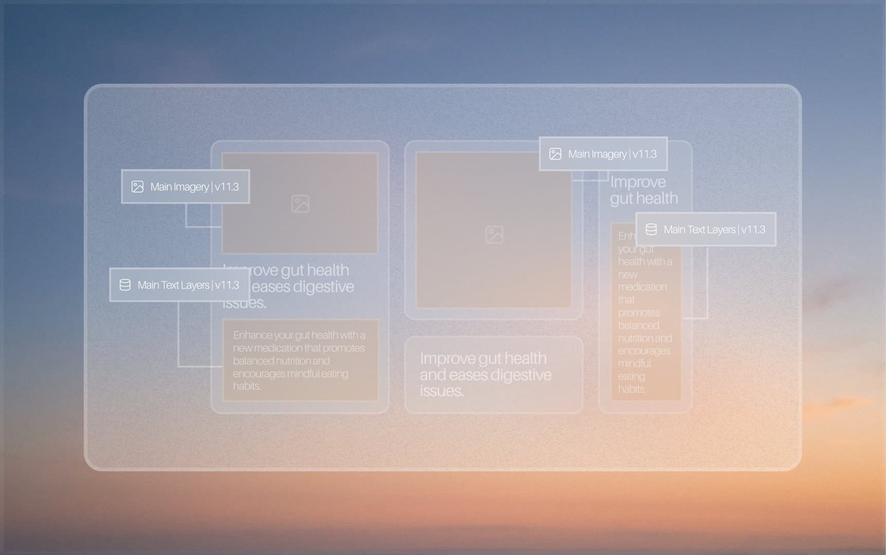
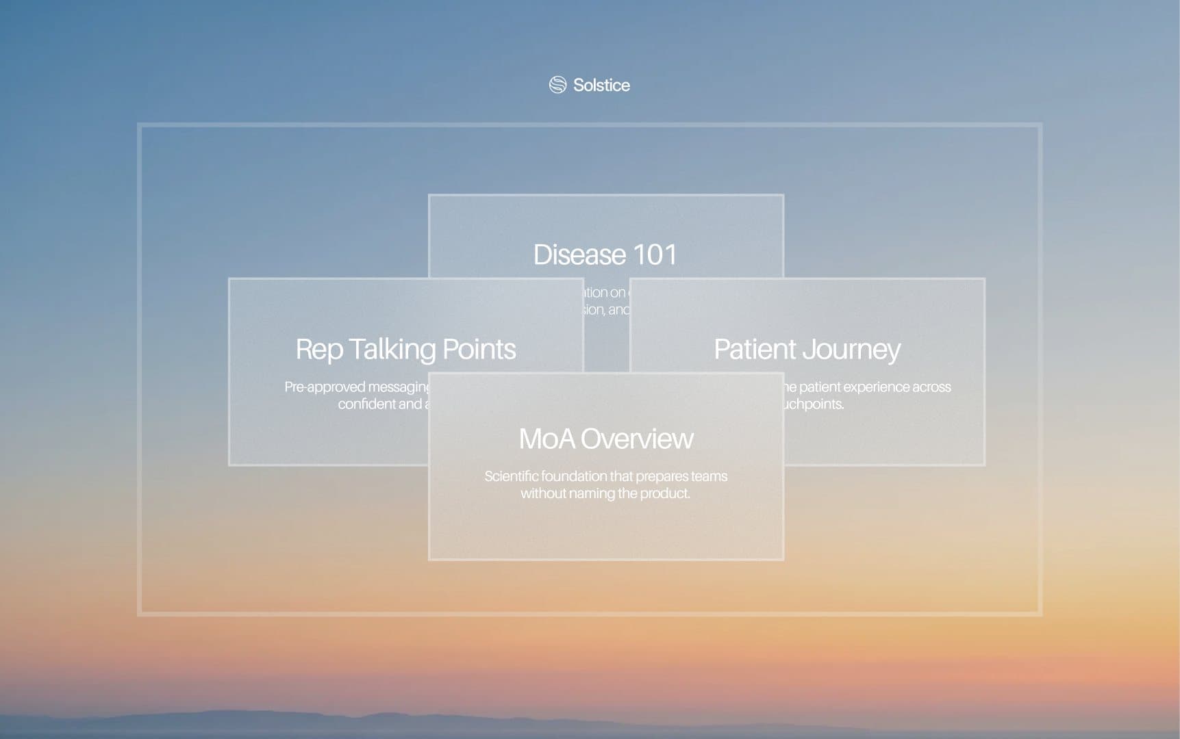
FIG. 7 — Product moments in glass over the brand’s sunrise skies
Design system
One system for the site, the deck, social and product visuals.
Glass panels over sky and sunrise for product moments, isometric layouts for product visuals, and a strategy deck in coal and white. Every page and post draws on the same type, colour and imagery rules, so a new launch looks like Solstice from day one.
FIG. 8–10 — The palette, 12x faster campaigns and the mark over clouds
The result
Series A, announced with the new brand and website live.
Solstice raised a $21M Series A, backed by Transformation Capital, Twelve Below and Virtue Ventures. The site carries the announcement, the solution pages and the newsroom, and the team keeps building on it themselves.
Credits

See where your website is
leaving growth on the table.
Drop in your URL. We run an AI scan on conversion, speed, search and brand, then send you a clear report with the three fixes that matter most.
Top fix: your pricing page has no clear next step. Adding one CTA could lift demo requests.