
From quality label to a brand sustainability leaders want to join.
Q-Selection certifies refurbished IT hardware that performs like new. We turned the label into a brand: a partner programme with three levels, a visual world for each, physical and digital badges, and a new website.
FIG. 1 — The Engaged world, with what the level brings
The challenge
Q-Selection was a quality label. It needed to become something companies want to belong to.
Q-Selection exists to assure buyers that certified refurbished products perform like new and help cut e-waste. Like most labels, it ranked what it certified with a score.
The ambition was bigger: an identity that stands for quality, conscious choices and progress. A culture and a community, and a stage for frontrunners in sustainability that companies connect to with pride.
FIG. 2 — The Q symbol, drawn point by point
Our approach
Not a score, but an invitation.
Instead of a classic gold, silver and bronze score, we built a visual structure. Aware, Engaged and Leader are not a judgement but steps, and each step has its own atmosphere, so you feel where an organisation stands and where it is heading.
We used world building to get there. Aware is calm and clear: cool tones, stone, ice and mist. Engaged turns green, from soft moss to living leaf. Leader becomes earthy and golden, with rich textures and powerful natural forms.
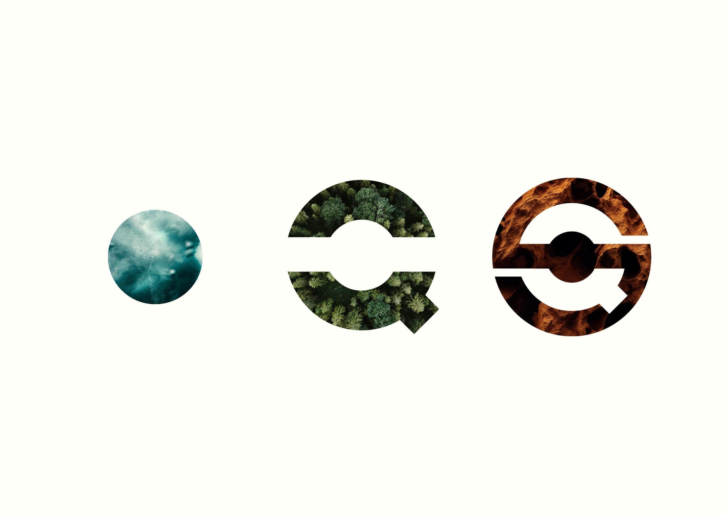
FIG. 3 — One anchor per level, each in its own material
FIG. 4 — Aware, engaged, leader
“Refurbished products that perform like new and leave a smaller footprint. That is not a transaction, it is a partnership.”

The solution
A brand system with three levels and one symbol.
Every partner level gets a visual anchor drawn from the Q logo: a dot for Aware, movement for Engaged and a closed symbol for Leader. Together they build up to the full mark, so the brand stays recognisable at every level.
The anchors carry through to physical labels, a digital partner badge that companies show on their product pages, and a new website that explains the label and the partner programmes.
- Brand identity and symbol system
- Partner programme: Aware, Engaged, Leader
- A visual world for each level
- Physical labels
- Digital partner badge
- Website design
FIG. 5 — The partner programmes on the new website
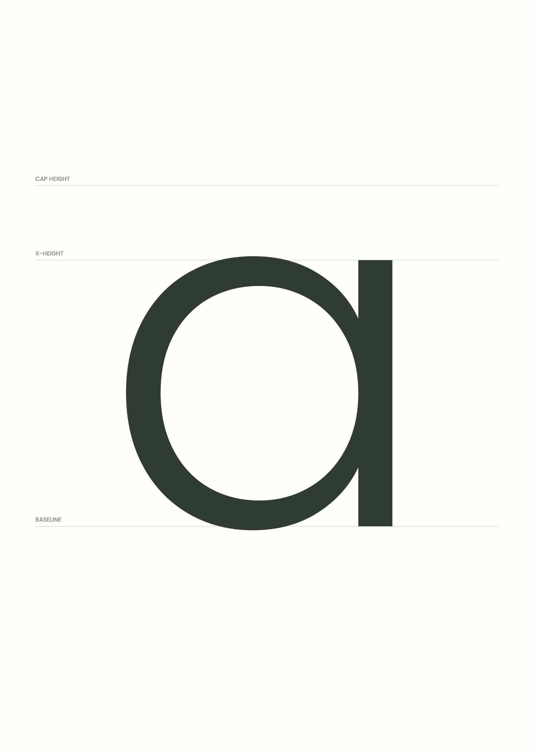

FIG. 6 — The single-storey a, the website line “De bewuste beweging begint hier” and the Q symbol in outline
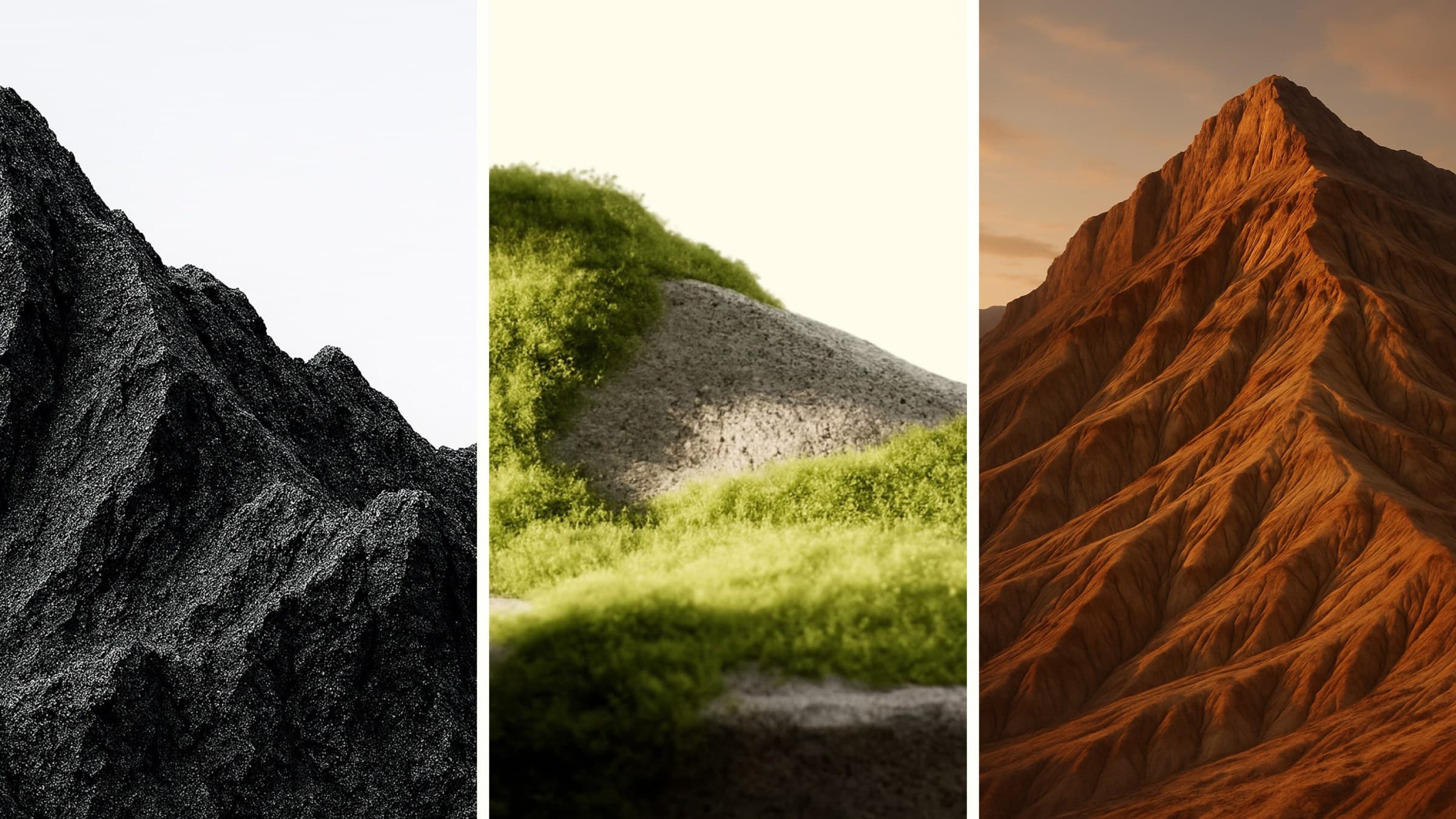
FIG. 7 — Aware, Engaged and Leader as landscapes
Design system
One system, from symbol to product page.
Each level pairs an anchor with a material and a colour world: deep blue for Aware, living green for Engaged and warm, earthy gold for Leader. The same system runs through the labels, the digital badge, the website and partner communication.
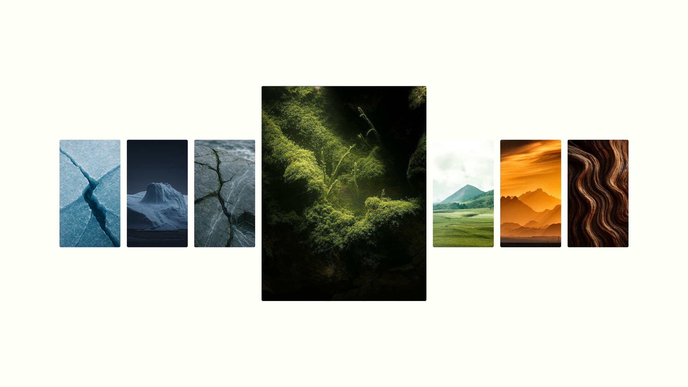
FIG. 8–10 — The photographic worlds, the palette and the Engaged vocabulary
The result
partner levels instead of a gold, silver and bronze score.
Q-Selection now has a brand that companies can grow into: start consciously, keep growing, make an impact. Every level is visible on the product, in the box and online.
Credits
See where your website is
leaving growth on the table.
Drop in your URL. We run an AI scan on conversion, speed, search and brand, then send you a clear report with the three fixes that matter most.
Top fix: your pricing page has no clear next step. Adding one CTA could lift demo requests.