
A name and a brand for the moment deals are won.
Kairos brings three AI sales products, AutoRFP.ai, AutoDDQ.ai and AutoDemo.ai, under one brand. We gave it its name and its mark, drew the product icons from the same system, designed the campaign and shaped the RFP workspace teams use every day.
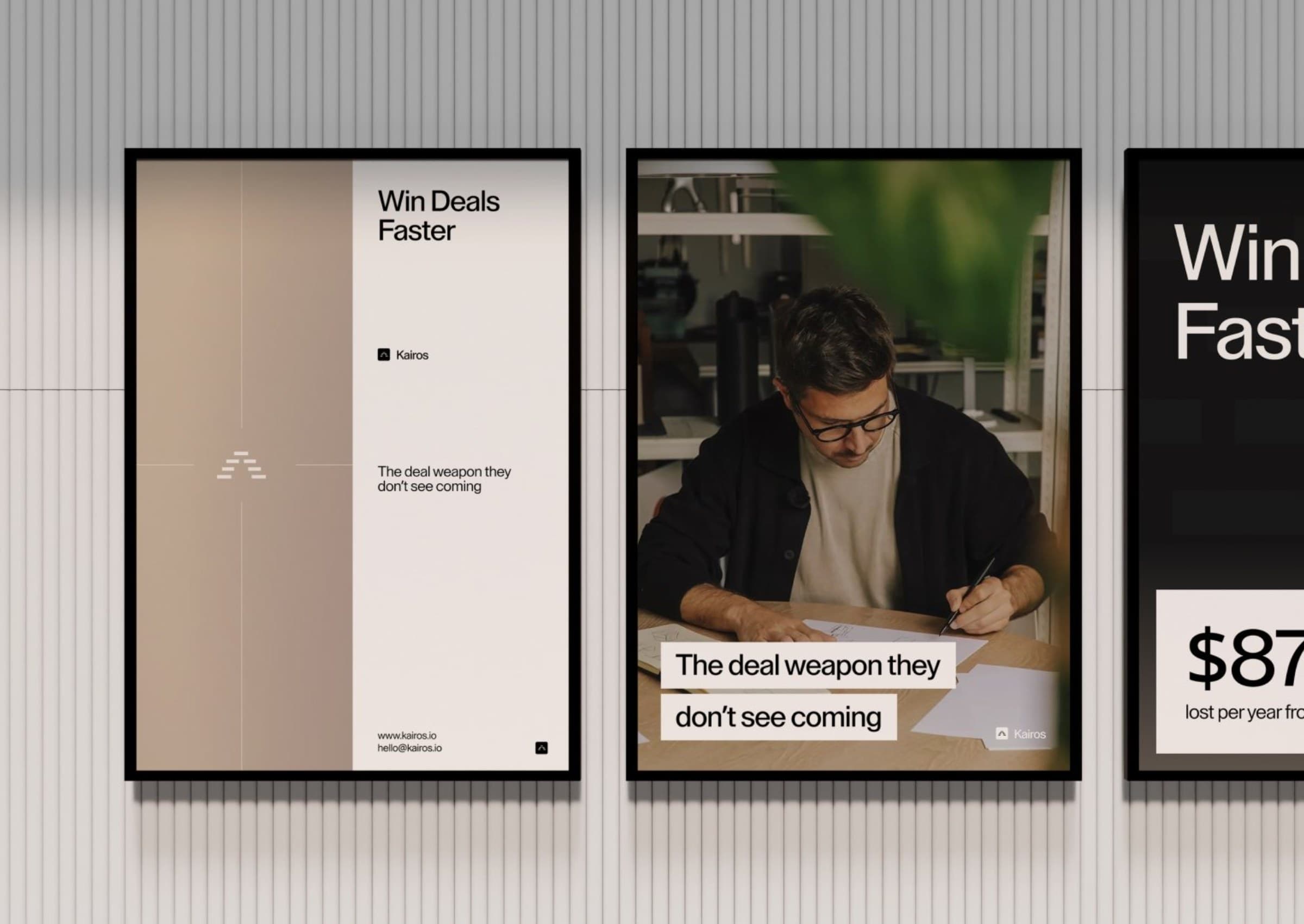
FIG. 1 — Campaign posters: “Win Deals Faster”
The challenge
In a market where new AI tools launch daily, a generic name disappears.
Kairos helps sales teams respond to RFPs, due-diligence questionnaires and security questionnaires, and run demos, with AI. Each product had its own name: AutoRFP.ai, AutoDDQ.ai and AutoDemo.ai. What was missing was one brand above them.
The window to own a distinctive position was closing fast. The company needed a name that earns curiosity before competitors claim the space, and a brand that makes three products feel like one family.
FIG. 2 — One prefix, a family of products
Our approach
A name about timing, and a mark that grows out of where the company came from.
Kairos (καιρός) is the decisive moment: the right time to act. Unlike chronos, linear time, kairos is about recognising the moment when action has the greatest impact. For a team that helps sellers win deals, that is the whole promise.
The mark starts with the A of AutoRFP. Turned into an upward arrow and then a peak, it becomes seven bars that build up step by step. The same bars draw the icon of every product.
FIG. 3 — Edit with Kairos
FIG. 4 — Every answer shows its sources
“The deal weapon they don’t see coming.”

The solution
One master brand, three product brands, one system of bars.
Kairos sits above AutoRFP.ai, AutoDDQ.ai and AutoDemo.ai. Every product icon is built from the same bars as the mark, so the family reads as one at a glance, from a dock icon to a poster on the wall.
The campaign pairs short, direct headlines like “Win Deals Faster” with photography of people at work, set on a warm gradient, charcoal and white.
- Naming and brand story
- Logo and mark
- Product icon system
- Campaign design
- RFP workspace product design
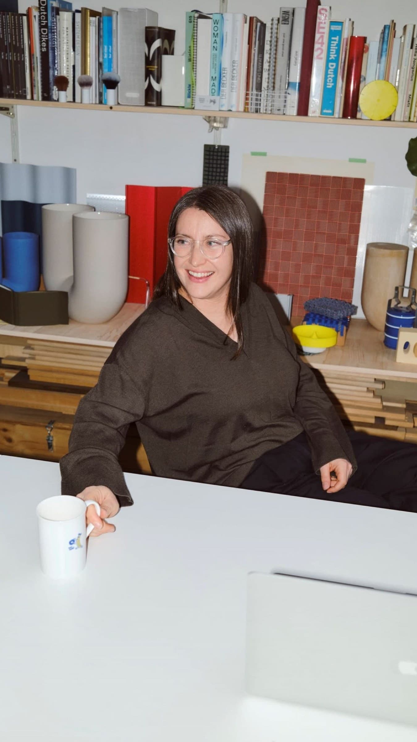
FIG. 5 — Campaign photography
FIG. 6 — Product icons for AutoDDQ.ai, AutoRFP.ai and AutoDemo.ai, built from the same bars
FIG. 7 — Pre-fill drafts the answers while you watch
Design system
A small kit that scales: bars, a warm gradient, charcoal and white.
The bars work at any size: as the mark, as product icons, as a pattern on dark backgrounds and as an outline graphic next to the wordmark. A sand-to-taupe gradient and charcoal give every touchpoint the same calm, confident tone.
The product follows the same restraint: a light workspace where every AI-drafted answer shows its sources and how well they match, so teams can move fast and still trust what they send.
FIG. 8–10 — The Answer Library, the colour palette and the mark
The result
products, now with one name, one mark and one voice.
AutoRFP.ai, AutoDDQ.ai and AutoDemo.ai now share a brand that ties them together, with product icons, a campaign and an RFP workspace designed in the same language.
Credits
See where your website is
leaving growth on the table.
Drop in your URL. We run an AI scan on conversion, speed, search and brand, then send you a clear report with the three fixes that matter most.
Top fix: your pricing page has no clear next step. Adding one CTA could lift demo requests.